Grafana Dashboards
Grafana provides the visualization layer for monitoring Quantum Pipeline simulations. The repository includes a pre-built thesis analysis dashboard that can be imported directly, covering VQE performance comparison, scientific accuracy, and system resource utilization.
Setup
When running the Docker Compose deployment, Grafana is available at http://localhost:3000 (default credentials: admin/admin). The monitoring stack is defined in docker-compose.thesis.yaml. Before importing dashboards, add Prometheus as a data source pointing to http://prometheus:9090 (internal) or http://localhost:9090 (from host). See the Grafana documentation for data source setup details.
Dashboard Import
Importing the Thesis Dashboard
The primary dashboard is located at:
View the full dashboard definition on GitHub: quantum-pipeline-thesis.json.
To import it:
- In Grafana, navigate to Dashboards > Import.
- Click Upload JSON file and select
quantum-pipeline-thesis.jsonfrom the repository. - Alternatively, paste the JSON content directly into the Import via panel json text field.
- In the Prometheus data source dropdown, select your configured Prometheus instance.
- Click Import.
The dashboard will appear under the name Quantum Pipeline - Thesis Analysis Dashboard.
Dashboard Variables
The thesis dashboard includes template variables that allow interactive filtering:
| Variable | Label | Description | Source |
|---|---|---|---|
DS_PROMETHEUS |
Data Source | Prometheus data source selector | Data source query |
container_type |
Container Type | Filter by container configuration (cpu, gpu1, gpu2) | label_values(quantum_system_cpu_percent, container_type) |
molecule |
Molecule | Filter by molecule symbols | label_values(quantum_vqe_minimum_energy, molecule_symbols) |
optimizer |
Optimizer | Filter by optimization algorithm | label_values(quantum_vqe_minimum_energy, optimizer) |
All variables support multi-select and an "All" option for viewing data across all configurations simultaneously.
Dashboard Panels
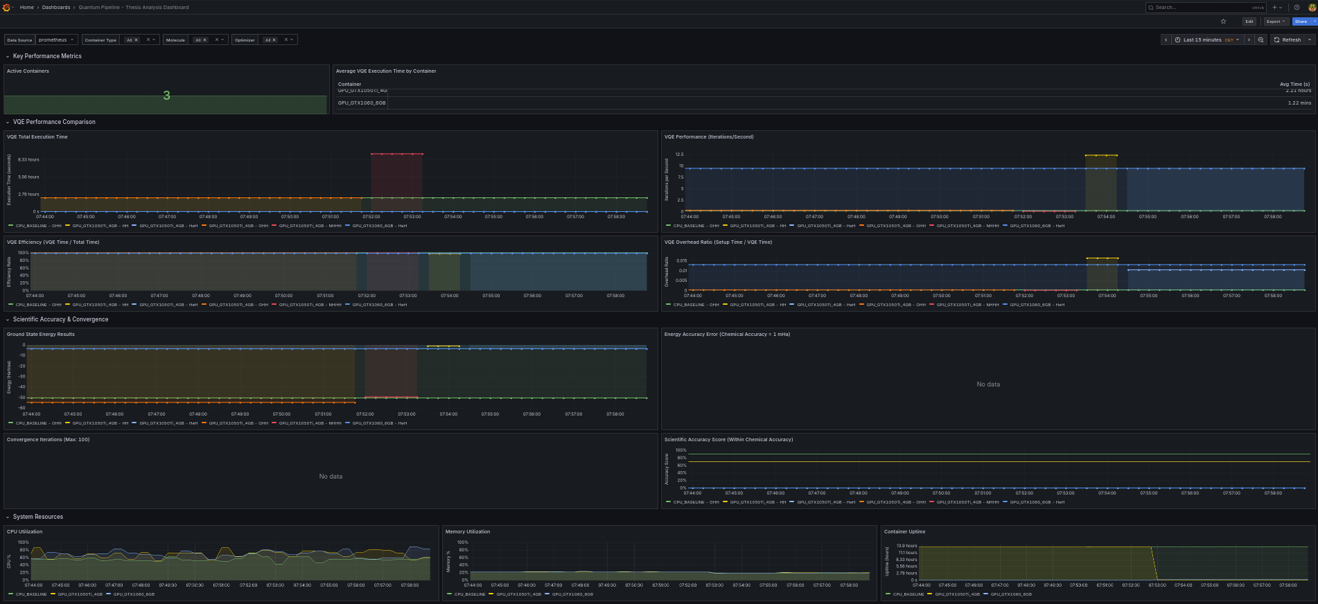
The thesis dashboard is organized into four row sections containing 16 panels total. Each section focuses on a different aspect of simulation monitoring.
Row 1: Key Performance Metrics
This row provides a high-level summary of the current state of the simulation environment.
Active Containers (Stat Panel)
Displays the count of currently active simulation containers. Uses the quantum_system_uptime_seconds metric to determine which containers are reporting.
Average VQE Execution Time by Container (Table Panel)
A table view showing the average total VQE execution time broken down by container type. This allows quick comparison between CPU and GPU configurations.
avg by (container_type) (
    quantum_vqe_total_time{
        container_type=~"$container_type",
        molecule_symbols=~"$molecule",
        optimizer=~"$optimizer"
    }
)
Row 2: VQE Performance Comparison
This section provides detailed performance analysis across different configurations.
VQE Total Execution Time (Time Series)
Tracks the total execution time for each simulation run, plotted over time. Lines are colored by container type and molecule, making it straightforward to identify performance differences.
quantum_vqe_total_time{
    container_type=~"$container_type",
    molecule_symbols=~"$molecule",
    optimizer=~"$optimizer"
}
VQE Performance - Iterations per Second (Time Series)
Measures computational throughput by dividing iteration count by total time. Higher values indicate more efficient computation.
VQE Efficiency - VQE Time / Total Time (Time Series)
Shows the ratio of time spent in the VQE optimization loop to the total execution time. Values closer to 1.0 indicate that most time is spent on actual computation rather than setup overhead.
- Y-axis range: 0 to 1 (percentage unit)
- Higher values indicate less overhead from Hamiltonian construction and qubit mapping
VQE Overhead Ratio - Setup Time / VQE Time (Time Series)
Quantifies the overhead of Hamiltonian construction and qubit mapping relative to the VQE optimization time. Lower values are better.
Row 3: Scientific Accuracy and Convergence
This section monitors the scientific quality of simulation results.
Ground State Energy Results (Time Series)
Displays the minimum energy values found by each simulation run. This is the primary scientific output metric, measured in Hartree units.
quantum_experiment_minimum_energy{container_type=~"$container_type"}
    or quantum_vqe_minimum_energy{
        container_type=~"$container_type",
        molecule_symbols=~"$molecule",
        optimizer=~"$optimizer"
    }
Energy Accuracy Error (Time Series)
Tracks the deviation of computed energies from reference literature values, measured in millihartree (mHa). The panel includes threshold lines:
- Green zone: Error below 1 mHa (within chemical accuracy)
- Yellow zone: Error between 1 and 10 mHa
- Red zone: Error above 10 mHa
quantum_vqe_energy_error_millihartree{
    container_type=~"$container_type",
    molecule_symbols=~"$molecule",
    optimizer=~"$optimizer"
}
Convergence Iterations (Time Series)
Shows the number of optimizer iterations required to reach convergence for each experiment. The panel has a maximum threshold of 100 iterations, with a red threshold line indicating runs that hit the iteration limit without converging.
Scientific Accuracy Score (Time Series)
A normalized accuracy score from 0 to 100 indicating how close the simulation result is to chemical accuracy. Threshold levels:
- Red: Below 70 (poor accuracy)
- Yellow: 70 to 90 (moderate accuracy)
- Green: Above 90 (good accuracy, within or near chemical accuracy)
Row 4: System Resources
This section monitors hardware utilization for each simulation container.
CPU Utilization (Time Series)
Real-time CPU usage percentage per container type. Threshold levels at 70% (yellow) and 90% (red) help identify resource saturation.
Memory Utilization (Time Series)
Real-time memory usage percentage per container type. Same threshold levels as CPU utilization.
Container Uptime (Time Series)
Tracks how long each container has been running, measured in seconds. Useful for identifying container restarts or failures.
Custom Queries
Beyond the pre-built dashboard, you can create custom panels using PromQL. The following examples cover common analysis tasks.
Comparing GPU vs CPU Speedup
Use a bar chart visualization to compare execution times side by side.
Molecule Complexity vs Execution Time
This query reveals how execution time scales with molecular complexity.
Iteration Efficiency Over Time
Tracks how iteration throughput changes over the course of a simulation.
Energy Convergence Rate
Measures the rate of energy improvement over a 10-minute window. Values approaching zero indicate convergence.
Resource Utilization Correlation
Create a scatter plot with CPU usage on one axis and execution time on the other to identify resource bottlenecks:
# X-axis
avg_over_time(quantum_system_cpu_percent{container_type="gpu1"}[1h])

# Y-axis
quantum_vqe_total_time{container_type="gpu1"}
Alerting
Recommended alert rules for Quantum Pipeline monitoring:
| Alert | Condition | Severity | Description |
|---|---|---|---|
| High CPU Usage | quantum_system_cpu_percent > 90 for 5m |
Warning | Container CPU is near saturation |
| High Memory Usage | quantum_system_memory_percent > 85 for 5m |
Warning | Container may be approaching OOM |
| Simulation Stalled | delta(quantum_vqe_iterations_count[15m]) == 0 |
Critical | No iteration progress in 15 minutes |
| Poor Accuracy | quantum_vqe_energy_error_millihartree > 100 |
Info | Significant deviation from reference |
| Container Down | absent(quantum_system_uptime_seconds{container_type="cpu"}) for 5m |
Critical | Expected container is not reporting |
For alert setup and notification channel configuration, see the Grafana alerting documentation.
For a complete reference of available metrics and their Prometheus names, see Performance Metrics.